Thursday, April 30, 2009

Case Study - Wausau Paper Intrigue Marketing Piece

In the design world, a project like this doesn’t come along that often. If I had to guess, I would say once in a blue moon. On a day-to-day basis, designers spend most of their hours on revisions, layout, production, image retouching, all of the mundane tasks of graphic design that no one really talks about. Ahh, these are the things designer dreams are made of. So when a project comes along that has the potential to be super creative, to break you out of the formatting rut you’ve been in, you run through the office, do a little dance, shout for joy, then dig in. This is the kind of project that makes designers who they are, the type of project that pushes you over the creative breaking point, that destroys your confidence and sanity, and then, when you’ve hit rock bottom, you get “the” idea. The career saving, sanity rebuilding, confidence boosting idea that makes it all worth while (kind of). That’s the kind of project the Intrigue brochure, folder and inserts was.


First, a little background. Intrigue is a new line of packaging papers, labels and boxes by Wausau Paper. This is a new area for WP, and the promotional materials needed to be competitive in this high end, sophisticated market. The promo pieces also had to showcase WP papers, and demonstrate how different paper types handle 4-color printing. And, of course, send out the all important “green” message. Easy, right?


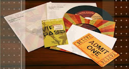
This multi-functional piece went through several life changes before it settled on the brochure/folder/insert combo. In its first life, this promo was meant to be a simple, 4-page brochure that acted as an introduction to the Intrigue brand and capabilities. But over time, we realized that this piece needed to have a larger purpose, it had to tell WP’s story, introduce the Intrigue brand, the various lines within the brand, the capabilities of each line, and be customized to each customer. Kind of a daunting task. But with some brainstorming, research, a bag or two of M&M’s, and a little soul searching, the Intrigue Multi-Functional Brochure (IMFB, as we’ll call it from now) was born.


The IMFB showcases three different paper selections. The brochure/folder cover had to be sturdy and hold it’s form well. It basically has to be an impenetrable fortress. So we settled on the Intrigue™ Folding Carton Stock in White (18 pt). It was printed with 4-color process with a custom die cut for the cover and folder. It also features an antique gold spiral binding. The inside pages needed to be a little flashier than the cover, so we went with the Royal Laid® in Natural (80 lb Cover). The Laid finish helps to reinforce the “green” message, and showcases one of the hottest paper trends for 2009: texture. Also printed with 4-color process, the rounded corners add another design element to give it that little extra somethin’ somethin’. The inserts demanded that they be strong and durable, since they will have to endure being taken in and out of the folder over and over and over again. Royal Resource® in Brilliant White (130 lb Cover) was the perfect match. This sturdy paper in bright blue-white beautifully shows off 4-color process and can stand up to even the roughest hands.


What is next for the IMFB and Intrigue? Soon it will be hitting the fine packaging market, and we are confident that it will go far. In the future, we have dreams of using the IMFB to showcase even more WP papers and printing techniques. Call it the IMFB 2.0. Perhaps a web site with up-to-date information is written in the stars? Who knows, maybe some day you will see Intrigue tweeting away, or maybe it will have a blog of its own. When you have such a fantastic product, and the service and brand power of WP behind it, who knows where life will take you.

Stumble Upon Toolbar

Free Fonts for All! - Part 1

Tired of the using the same fonts over and over and over? Sure we all have our favorites, but if you want to break out of your font rut, without breaking the bank, check out these resources for free fonts. And this is just a mini list, there will be more to come.


Retro-style fonts, these are perfect if you are looking an oh-so-cool vintage font (Mess Kit is one of my favorites). Available fonts change, and once they are gone they are gone for good, so check often to see what is available. They can be used for both personal and commercial use (read their license agreement for more info). Retro clip art is also available, but unfortunately it is not a free download.


Right now there are about 14 free fonts available for download. I recently COM4t Fine Regular, a more “fancy-pants” san serif font. Fonts are free for both personal and commercial use (read their license agreement for more info).


9 fonts available for free download (more available for purchase), my favorites are Anivers, a san serif font with attitude, and Fertigo Pro which is anything but your typical serif font. Fonts are available for download through MyFonts for both personal and commercial use (read license agreement for more info).

Do you have a site that you visit often for free fonts (or free anything for that matter)? Send it my way! I'm always looking to expand my free resources (who isn’t?).

Stumble Upon Toolbar

Wednesday, April 22, 2009

Creative Inspiration - Part 2

It’s finally here! I know that you’ve been patiently waiting. Well, maybe not patiently. Part two of our creative inspirations. For you reading pleasure, here are just a few more of the many, many was to find inspiration.

Helping Others

Sometimes the most inspiring thing that you can do is helping others. Whether that means giving a co-worker feedback on a web site they are designing, brainstorming ad concepts with a team, or participating in on-line forums such as SmashingMagazine the Graphic Design Forum or Estetica. Just knowing that I've helped create that glimmer in someone's eye when they have an idea, or helped solve a problem that someone has been stuck on, reminds me that the work I do has value, and gives me that extra little push and boost in confidence that is needed to be creative.

Pro Bono Work

Similar to being inspired by helping others, doing work for a good cause, something that gives you the warm fuzzys, can bring out the best creative ideas. Creating a web site that helps young pregnant women in need, a web site and CD that helps to raise money for children in Africa, a web site raising donations for a sick little girl, any cause or fundraiser that pulls at your heart strings and bring tears to your eyes can be the best inspiration around. It's so important to know that creative work has value, that it can inspire someone to donate, to reach out and help someone in need, or to help spread the word about a cause that affects them personally.

Keeping Up with the Trends

Sometimes all it takes is browsing through the latest design annual from Print, How or CommArts. Just reviewing the outstanding design pieces of the year will open your mind and start the ideas flowing. A great font in a brochure combined with an illustrated logo style and a patterned background from a web site can be combined to make a fresh and exciting Call for Entries. Don't be afraid to borrow pieces from another design and make it your own. Who knows, maybe you'll come up with something so innovative that it will end up in next years design annual, and you will be the inspiration for another creative-blocked designer!

Other People

Sometimes all it takes to get out of a mind block is just talking to those around you, be that coworkers, spouse, family, friends, or that friendly man at the gas station (you know, the one who hangs out there all day, everyday). Each person, with their unique interests and out look on life, can get you thinking in a new direction, maybe one that you never would have explored before. Next thing you know, a brilliant idea a ad is born. Just like magic.

Do Something Mindless

Every once in a while all it takes for creative genius to strike is just giving your mind a break and letting it do it's own thing. That could mean doodling, not anything in particular, just letting your mind go to see where it will take you. What's that on the napkin you just scribbled all over? Hey, it's a brilliant logo! Or lose yourself in a book or movie (it can even be one of those cheesy romance movies, no one is judging!). If you just let your mind go, no pressure, no one breathing down your neck, brilliance will strike. And you actually get to sit down and enjoy yourself for once.

What Inspires You?

I'd love to keep this post going, but I need some help! What gets you out of your rut and into the creative zone? I'd love to hear your creative inspirations.

Stumble Upon Toolbar

Wednesday, April 15, 2009

Images that Inspire

Just wanted to share some inspiring photos. Some beautiful, some thought provoking, some just plain weird. Enjoy!


Stumble Upon Toolbar

Tuesday, April 7, 2009

Creative Inspiration - Part 1

It's happened to all of us, even the most seasoned design professionals. You sit down at your computer, ready to produce some amazing work for a new project that you are super excited about. You have your mouse in one hand, and some Starbucks in the other. And then…nothing. No ideas. No glimmer of creative brilliance. Now what?

There are many, many different ways to find creative inspiration, and while different things work for different creatives, here are a few things that spark ideas every time. And this is just part one of a two (or more) part series.

Music
For the longest time,
Mike Doughty's Haughty Melodic could inspire me when nothing else would. I can't really explain it. There isn't one specific song, it isn't because it is a ground-breaking album, he isn't even one of my top 5 favorite artists. But there's just something about it that allows me to open my mind, and then the ideas start flowing. I must admit that I haven't listened to this album for a while, probably at least a year, but I bet that the next time I get stuck and need an idea, I can put on this album, sit back and let the ideas come to me.

Pressure
Believe it or not, I'm most productive, and creative, when there's pressure. A quick deadline, a new and exciting project, work overload. There's something about the added pressure that gets my heart racing, my blood boiling, and the ideas flowing. Of course, sometimes this backfires and too much pressure makes my mind lock up tight, no ideas, no confidence, no time left. But then I simply turn on Busting Up a Starbucks (see inspiration #1) and I'm back in business.

New Environment
Sometimes the best thing to do is to just get out. Leave the office or home, sit outside, get some coffee (yes, Starbucks can be an inspiration), window shop, browse through the local unique flower shop. Anything to get your out of your chair, to get your body and mind moving again. Something just a simple change of location can give your mind the spark it needs to start working. But don't stay away too long, there's still a lot pressure waiting for you back at the office.

Interior & Fashion Design
That's right, interior and fashion design and graphic design influence each other. Who knew? Interior and fashion design trends are a great source for beautiful textures and colors interacting together. A funky chair could inspire a logo. A new fabric pattern could inspire a web site. The possibilities really are endless, so don't feel bad about looking at newest fashions at work! It's all in the name of inspiration.

Art History
It's true history repeats itself, but who said that has to be bad thing? Knowing where art and design comes from, what worked and what didn't, is a great way to find inspiration. While browsing through some old art books something from the Art Deco era will catch your eye, and inspire a new logo. Maybe the red and orange hues in the sunset in Edvard Munch’s The Scream inspire a color palette for an annual report. So browse through those art history books, visit an art museum, paint-by-number, what ever floats your artistic boat.

What Inspires You? Part two (and maybe part three, four, five…) of this post could use some more ideas. What gets you out of your rut and into the creative zone? I'd love to hear your creative inspirations.

Stumble Upon Toolbar

Wednesday, April 1, 2009

Drop Down Menus

I recently read an article discussing drop down menus and their effectiveness, and it got me thinking. As a designer I never saw drop down menus as a problem before, unless they were poorly executed. But this article got me thinking about how and when drop down menus should be used and what their purpose is. Here are some of my more brilliant thoughts.

The first and most important purpose of a drop down menu is to de-clutter. Some sites have so much content that it just doesn't make sense to list all of the individual links on the home page. It would be overwhelming, cause confusion, and as a result, drive away traffic. Adding drop down menus can help make a web site look more appealing, cleaner and more professional. It also allows the site to be more user-friendly because visitors don't have to sift through a ton of information/links to find the one or two links that they are interested in. It makes the visitors’ experience more enjoyable and informative, and that is after all the main goal of a web site.

A secondary, but still important purpose, is that drop down menus give the site individuality. There are endless options for drop down menus, and as long as they are executed well, they add a positive note to the visitors experience, making the site more enjoyable and more memorable. By doing something unique and creative with the drop downs, you give visitors something to remember, and that will keep them coming back.

And of course, the obvious (and kind of boring) reason that drop down menus are a good idea: the links are organized by topic. This makes it quick and easy to find a specific subject, then find all of the content on the site that relates to it. Visitors can navigate to the topics they want to learn more about, and avoid those they do not. This way visitors don't have to read through pages of content before they find what they are looking for. It gives the visitor more control over what they see, and doesn't waste their time with content that they are not interested in.

But of course, drop down menus can go horribly wrong. If they are not carefully planned, the menus can interfere with the rest of the site, they may not function properly or they make the site more cluttered and difficult to navigate through. All of this creates a bad visitor experience and deters visitors from exploring more of the site, or from visiting it again.

Good Examples of Drop Down Menus
www.jnj.com - fluid motion, doesn't interfere with the content on the page, helps organize and declutter the home page. This type of drop down is a strong design element on the site, the menus are part of the design, not an afterthought.
www.mediatemple.net - Simple and effective way to organize multiple links.
www.tnvacation.com - Simple drop down menus that don't interfere with the content on the site.
www.fossil.com - Simple drop downs that are minimized, not really a design element, just a way to organize links
www.flowrestaurant.com - A fun and simple example of drop down menus that reinforces the design on the rest of the site.
www.hopewausau.org - Simple drop down menus that don't interfere with the design or content.

Drop Down Menus Gone Bad
www.navigantconsulting.com - The menus interfere with the text on the index page, making it difficult to read the links.
www.digg.com - This may be a personal preference, but I expect drop down menus to appear when I hover over the link. I don't expect to have to click on it to see the rest of the menu. So, while these menus are functional, it would make more sense that they automatically appear when you hover over the link.
www.alienware.com - Menus are difficult to read (black on black)

Stumble Upon Toolbar